The Foundation of Funny: Why Typography Matters in Halloween Shirt Design
When you’re hunting for that perfect Halloween shirt, it’s easy to get swept up in the joke itself. We all love a good pun, a clever wordplay, or a sarcastic jab that perfectly captures our October mood. But what often goes unnoticed, yet plays a crucial role in whether a shirt truly lands, is the design quality. Specifically, the typography. The way words are presented can either elevate a joke into a wearable piece of art or relegate it to the dusty corners of novelty shops. At Funny Halloween Shirts, we believe that great halloween shirt design quality is not just a bonus; it’s fundamental to earning that laugh.
Think about it: a fantastic pun delivered in a chaotic, hard-to-read font is like telling a joke with a stutter. The humor gets lost in translation. We’re committed to ensuring our shirts are not only funny but also visually appealing and well-crafted. This means paying close attention to the nuances of typography, composition, and overall aesthetic. It’s about creating a premium graphic tee experience where the design works as hard as the punchline.
From Chaos to Clarity: Our Approach to Balanced Composition
Many places slap a joke onto a t-shirt and call it a day. The result? A jumbled mess that looks like it was designed by a committee of squirrels. We take a different approach. Our design philosophy centers on balanced compositions. This means every element on the shirt—the text, any accompanying graphics, and the negative space—works in harmony. We aim for a visual flow that guides the eye and enhances the humor, not distracts from it.
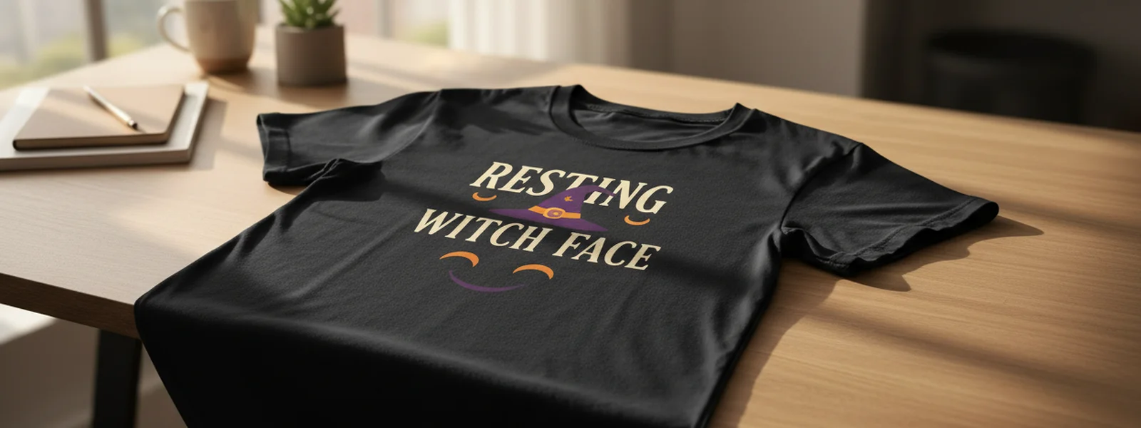
This dedication to a balanced shirt composition ensures that the joke is not only readable but also impactful. We spend time arranging elements, considering font pairings, and ensuring that the overall design feels intentional and polished. It’s the difference between a shirt that looks like an afterthought and one that feels like a carefully considered piece of wearable art. For instance, our
All Men Are Cremated Equal T-Shirt
The Longevity of Good Design: More Than Just a Trend
Trends come and go, especially in the world of graphic tees. What looks cutting-edge one year can feel dated the next. Our goal at Funny Halloween Shirts is to create designs that have staying power. This means avoiding overly trendy fonts or graphic styles that will quickly feel passé. Instead, we draw inspiration from timeless aesthetics, focusing on clarity, readability, and a touch of mid-century charm that lends itself well to humor.
We believe that a well-designed shirt should look good year after year, not just during a single Halloween season. This commitment to lasting design is why we invest heavily in understanding modern Halloween typography and how it can best serve our puns. It’s about creating pieces that you'll be happy to pull out of your drawer every October, not ones you’ll hide away after a single wear. Explore our Premium Halloween Tees for designs that are built to last.
Elevating Humor Through Thoughtful Design
The humor on our shirts is the star, but thoughtful design is the stage that makes it shine. A great pun, like those found in our Halloween Dad Joke Shirts, deserves an equally impressive presentation. We consider how the font choice can amplify the tone of the joke—a quirky handwritten font for a whimsical pun, a strong serif for a more declarative wisecrack. It’s about adding layers of meaning and personality through visual elements.
Our founder story highlights this commitment: we wanted shirts that were more than just a joke; we wanted something you could wear to the office, the trunk-or-treat, and the staff-room potluck without explanation. This vision guides every design decision. We ensure that the halloween shirt design quality is so high that the shirt itself becomes a conversation starter, even before the punchline is read. Discover the difference in our
, where the design perfectly complements the humor.Typography as a Tool for Humor
Typography isn't just about making words legible; it's a powerful tool for conveying emotion and tone. For a brand like ours, focused on witty wordplay and wholesome-corny humor, the right font can make all the difference. We meticulously select typefaces that enhance the overall feel of the joke. Are we going for a playful, slightly silly vibe? A bold, confident statement? Or a dry, sarcastic wit? The font choice helps answer these questions visually.
Consider the difference between a joke printed in a sterile, blocky font versus one rendered in a characterful, slightly distressed typeface. The latter often adds a layer of personality that resonates more deeply with our audience. We are constantly exploring modern Halloween typography that feels fresh and engaging, ensuring our shirts stand out. This attention to detail is why many of our customers return, knowing they can trust our halloween shirt design quality to deliver both laughs and style.
Beyond the Joke: The Craft of a Great Graphic Tee
At Funny Halloween Shirts, we see ourselves as creators of wearable art. The joke is the spark, but the design is the craft that brings it to life. We believe in the power of a well-executed graphic tee—one that feels substantial, looks great, and tells a story. This philosophy extends to everything from the initial sketch to the final print. We ensure our designs are optimized for direct-to-garment printing, meaning they look fantastic on both light and dark garments.
Our commitment to high halloween shirt design quality means you won't find any clip-art chaos here. Instead, you'll find thoughtfully composed designs that are a pleasure to wear. Whether you’re looking for a
that’s perfect for your favorite healthcare hero or a Funny Halloween Pun Shirt to bring a smile to everyone you meet, our designs are made to impress. We invite you to explore our entire collection and see the difference that quality design makes.The Funny Halloween Shirts Difference: Designed to Last
What truly sets Funny Halloween Shirts apart is our unwavering commitment to design excellence. We don't just aim to make you laugh; we aim to make you look good while doing it. Our focus on typography, composition, and overall aesthetic ensures that every shirt we offer is a high-quality piece of apparel that you'll be proud to wear.
We believe that the best Halloween shirts are those that combine genuine humor with smart, appealing design. It’s about creating a connection with our audience through shared wit and a visual style that’s both modern and timeless. From the initial concept to the final stitch, every detail is considered to ensure you get a shirt that not only makes you laugh but also becomes a favorite in your wardrobe. Experience the difference that premium graphic tee design makes by browsing our All Funny Halloween Shirts.
A Note on Our Design Philosophy
We started Funny Halloween Shirts because we felt there was a gap in the market for Halloween apparel that was genuinely funny without being offensive or cheaply made. We wanted something you could wear to a family gathering or a work event with confidence. This led us to focus on the fundamentals: clear, engaging typography and balanced compositions. Our designs are meant to be appreciated for their wit and their visual appeal, making them perfect for anyone who loves Halloween and appreciates good design.
We stand by the quality of our work, ensuring that every shirt earns its laugh. This dedication to halloween shirt design quality is what we believe makes us unique. It’s about more than just a joke; it’s about the entire package—the humor, the style, and the lasting impression. Discover your next favorite funny Halloween shirt today.
Ready to Shop?
Browse our collection — Halloween shirts that earn the laugh, not the scream..
Shop All Shirts
Published by Funny Halloween Shirts
Halloween shirts that earn the laugh, not the scream.
Frequently Asked Questions
Why is typography important for a Halloween shirt?
Typography is crucial because it dictates how the joke or pun on the shirt is perceived. Good typography makes the text legible, enhances the mood of the design, and ensures the humor lands effectively. Poor typography can make a funny shirt look chaotic or unappealing, undermining the joke itself.
What makes a Halloween shirt design 'balanced'?
A balanced Halloween shirt design means all visual elements—text, graphics, and negative space—work harmoniously. It creates a pleasing composition that guides the viewer's eye and makes the overall message clear and impactful. This avoids a cluttered or haphazard look.
How do you ensure your Halloween shirt designs have longevity?
We ensure longevity by avoiding overly trendy fonts or graphic styles that quickly become dated. Instead, we focus on timeless aesthetics, clarity, readability, and a touch of classic charm that ensures our shirts remain appealing and humorous season after season.
Can a design elevate the humor of a Halloween shirt?
Absolutely. A well-crafted design, from the choice of typeface to the overall composition, can significantly amplify the humor of a pun or joke. It adds personality and context, making the shirt more engaging and memorable than just the words alone.
What is the difference between your designs and typical novelty shop shirts?
Our designs prioritize thoughtful composition and high-quality typography, offering a premium graphic tee experience. Unlike many novelty shops that use clip-art or chaotic layouts, our shirts are intentionally designed to be visually appealing and the humor is enhanced by the aesthetic, not hindered by it.
How does Funny Halloween Shirts approach 'modern Halloween typography'?
We explore modern Halloween typography by looking for fonts that feel fresh, engaging, and relevant to contemporary humor, while still ensuring legibility and complementing the pun. This involves balancing classic readability with a touch of playful character that suits our brand's voice.
First Access to New Designs
New Halloween puns drop weekly — be the first to know before the good ones sell out.